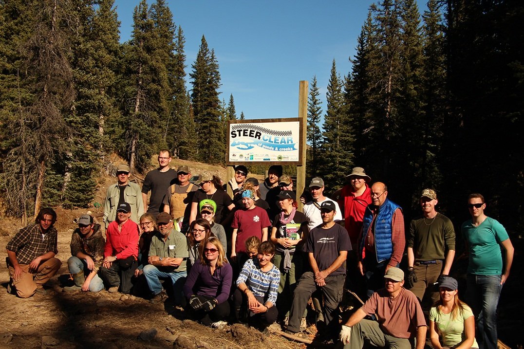
Central to Communications and Outreach for the OWC is the invention of a new visual branding element—not a new logo, but something we can use in addition to our current logo—an image that immediately conveys who we are to the public at large.
There are a lot of perspectives to consider. For one thing, the OWC is now 10 years old, and the three blue letters in the current logo are instantly recognized by anyone familiar with our organization. But what about attracting a new demographic? Anyone unfamiliar with us isn't able to tell what our purpose is from that simple abbreviation.
A strong logo reflects an organization's values and embodies its goals. A tall order for a simple drawing, perhaps—but look at how powerful the Nike swoosh is, or the Mercedes star. Those symbols have become synonymous with the organization itself.
Looking around at other environmental organizations, it seemed fairly straightforward: a mountain in the background, a stream running in the foreground, and a couple of evergreens to the side. But how would anyone distinguish us from countless other "conservation", "outdoor" or "water" non-profits? Clearly, we needed something unique.
In fact, the uniqueness of the Oldman Watershed is what has inspired this design. We have not only a great diversity in geography and flora and fauna, but a diversity of ethnicities and industries as well. Our watershed begins in some of the most beautiful mountains in the world and travels out to rich grasslands—also one of the driest, flattest places in Canada.
Perhaps our biggest challenge, however, was embodied in the name "Oldman" itself. It practically begs anthropomorphization. According to many First Nations' accounts, the Oldman refers to Naapi, the Trickster, who the Creator tasked with making the Earth and its creatures. We couldn't use just any old man—and we needed to realize fully the implications for honouring First Nations. Our Oldman needed to embrace people of all cultures while still harkening back to his Indigenous roots.
Dan Wilton of Wilton & Wark had been awarded our RFP for web design and put his creative talents to work based on our sketches. He created an initial image based on the archetypal "Green Man"—a kind of nature spirit common to many Indigenous and early western cultures. We agreed that we needed a "Green-Blue Man"—a figure that would emphasize more clearly the natural connection to water.
What a great segue into the concept of a watershed! One of the OWC's greatest challenges is communicating to people what, exactly, a watershed is. The notion that what happens on the land is fundamental to both water quality and quantity is something we are constantly struggling with. Dan took the central role of trees to heart and depicted clearly how everything from the canopy to the root system is integral to watershed health.
The design is thus divisible horizontally in that everything above the eyes is terrestrial, and everything below it is aquatic.
Still, something was missing. We sent the image around to a focus group consisting of scientists, journalists, students, seniors, artists, and communications professionals. It seemed to pass the test with flying colours—but not with the First Nations' representatives in the group. "Where are the animals?" they asked. Good question.
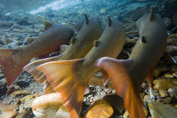
On this basis, we decided to drill deeper into the symbolism the OWC team worked hard with our intern, Jayme Cabrera Lopez (an ace at Photoshop!), to develop the image further. It was natural to include fish—not just any fish—but the West Slope Cutthroat Trout which are both endangered and an indicator species in our watershed.
Hidden in the tree canopy, there is a clever interpretation of another nearly extinct species—the Plains Bison. The design requires you to look—and look again, while still being instantly recognizable as pertaining to a conservation organization. We took care to ensure that the image was symmetrical, with the left half mirroring the right.

But how to finish the design? It wasn't coming together properly in the all-important "third-eye" area of our Green-Blue Man. We had the water, and the land, but we realized we were missing the element of air: the celestial realm. Again, not just anything would do. An eagle—a solitary eagle—was needed to crown the image. After all, "Naapi's Playground" up in the headwaters contains "The Place of Eagles" where thousands of golden eagles migrate, up the crest of the Livingstone Range each year. It was a fitting final touch.
The image swirls below with rounded, organic shapes that invoke images of water, moves the eye up to the delicate leaf patterns and more abstract formations, and further up into the more geometric branches and mountains.
Heartfelt thanks to Kyle Dodgson of Tinker Inc. for conjuring the perfect colour palette to match the vision.
Colour carries meanings and communicates ideas.
In this regard, we have been pretty clear about the traditional use of green and blue, while also including the distinctive, firey red strip under the throat of the West Slope Cutthroat Trout. The Oldman's eyes are warm and brown—just as those of Naapi would be. Like any great logo, it is still very versatile and functions well in grayscale. We can simplify it for use on a small scale, or we can use it in full detail for large posters. It is going to be a great teaching tool for both children and adults.
Best of all, this is a design that we developed ourselves. It won't get old and it won't fall out of fashion. It's ownable and uniquely recognizable. It can work with or without the current blue OWC lettering, much like the "Coke" bottle cap is an additional symbol to the traditional "Coca-Cola" lettering.
There appears to be a universal yearning for some kind of offline authenticity and a deep search for connection to what makes us human. We want to become reacquainted with a spellbinding narrative that involves values, ethics, and care, apart from naked commercial value.
Our design thus asks you to look, look again, reflect, and act.
But wait—there is one more, all-important, element hidden in the design. What do you see?
According to Blackfoot legend, Naapi is a Trickster, a shape-shifter; at once a fish, a rock, a tree. Embodied in all the elements and all the creatures, Naapi is everywhere.
Thank you to our First Nations for reminding us of the holistic perspective necessary to understand humans—and all living things—in the watershed. Thanks specifically go to William Singer, Lori Brave Rock, Randall Wolftail and Stanley Knowlton—and all the Elders with whom they consulted, for their help, advice and gentle teaching—in developing this image.